
Whoever said “beauty is in the eye of the beholder” obviously never saw this lot. Box art is the first thing a prospective customer sees on the shelf, so it’s amazing that these examples made it through quality control.
The tragic thing about these artistic abominations is that many of them are actually fine games. Some are even great games. Sadly some shoddy art direction (or complete lack of it) mean most aren’t given a second glance on the shelf. Which might not be a bad thing.
[Thanks goes out to members of The Boardgame Group and /r/boardgames subreddit for their artistic sensibilities and uncompromising, scathing criticism in helping to compile this list.]
20. Great Western Trail (2016 — Stronghold Games)

No amount of facial hair, lack of a neck and surrounding steam is going to disguise the fact that two of these cowboys are the same guy.
A damn fine game, packaged with dead, soulless eyes and a locomotive that defies all the laws of drawing and physics.
19. Guildhall (2012 — Alderac Entertainment Group)

“Meet the wife. I luv ‘er more than any pig, and that’s sayin’ summat.”
Indeed, sir. For a pig-rustling peasant you appear to be punching way above your weight.
It’s not that the characters are badly rendered (although it does appear that it’s simply photo overpainting at work here), or the inconsistent lighting and flat boring background. It’s just a bizarre motley collection and a piglet with a nose four sizes too big.
18. World in Flames (1985 — ADG)

There’s nothing wrong with the infantryman, B17 Flying Fortress or the Battleship. Actually scratch the last: the battleship is awful. And the infantryman’s wrist is as thick as his right thigh is long. But the plane looks okay.
That aside, the main rule broken here is: don’t create a piece of art that reminds you of a cock and a pair of balls. End of.
17. Zephyr: Winds of Change (2017 — Portal Dragon)

More genuinely disturbing portraiture. Similar to Great Western Trail, the old adage applies: if you can’t draw faces, stick to something else. Like clouds. Top job on the taxidermied peregrine falcon though – really captured the essence of it’s dead, stuffed nature there.
16. Caylus (2005 — Ystari Games)

I heard this recently described as “an ugly medieval prog-rock album cover” (bravo, Erik). ‘Nuff said. To their credit the publisher changed the box art for a future release to something simply mediocre.
15. The Downfall Of Pompeii (2004 — Mayfair Games)

You learn a few basics when you study fine art. One of them is using a vanishing point when constructing a landscape. In an image like this there should be just one. It has about five.
That’s before we even get to why the guy in the centre is carrying a curtain pole, the exorcist neck guy on the left, or the legionnaire directing people back towards danger. There’s a lot going on here, and none of it is right.
14. Plethora (2012 — Garphill Games)

Seriously? This looks like some sort of despicable National Socialist propaganda from 1930s Germany. Thankfully Shem Phillips’ recent “North Sea” series features fantastic box art, and not something bordering on the offensive (to sensibilities if nothing else.)
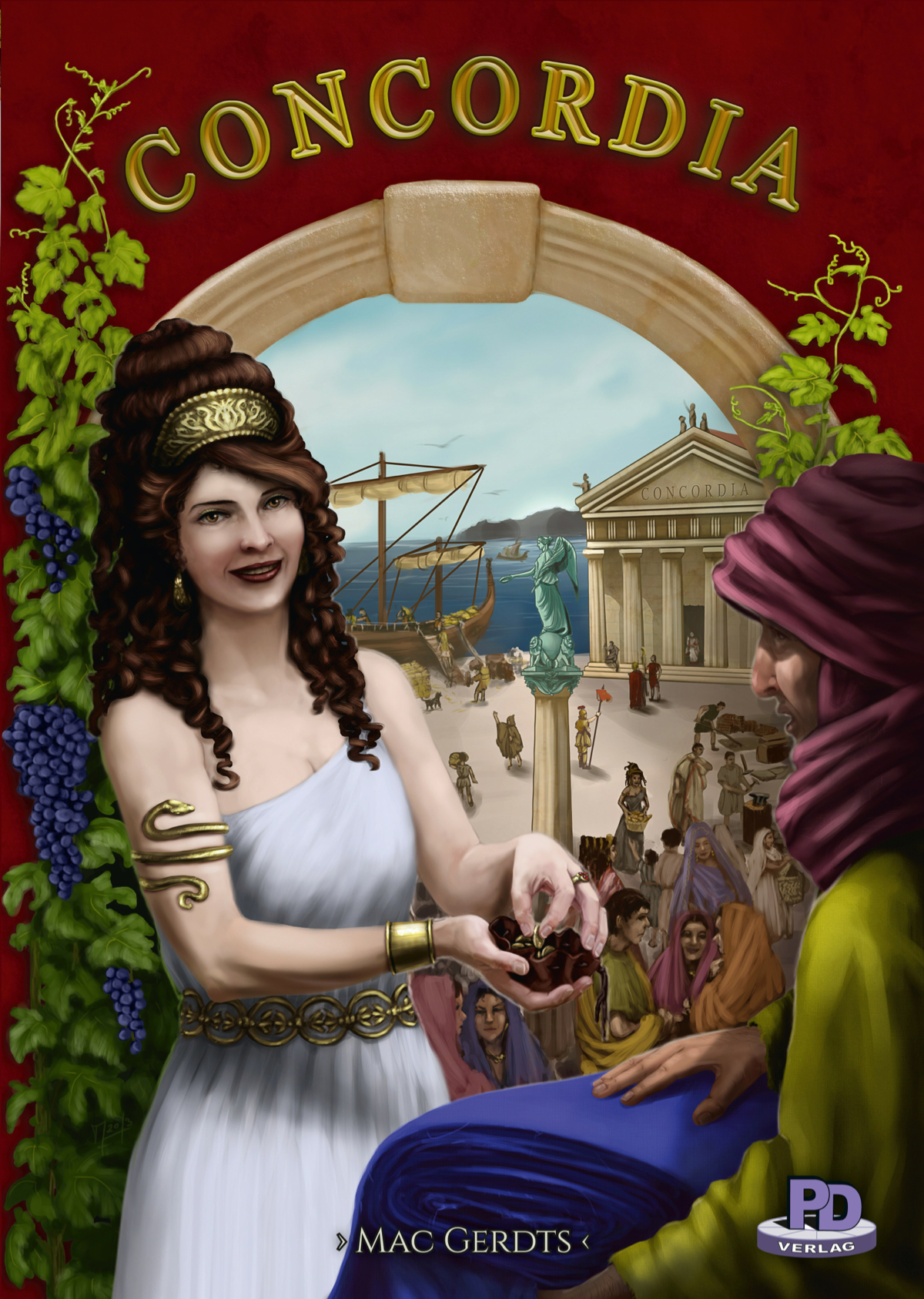
13. Concordia Salsa (2015 — Rio Grande Games)

There’s a fair amount of distaste in the community for the core game box art of Concordia, but in fairness the lady on the front is actually technically okay, if slightly creepy and set against a bland, crap background.
However, in deference to the masses and going against the grain of listing only core game box art rather than expansions, I give you Concordia Salsa. It’s sh*t on so many levels from the composition, to freakish hands, crap anatomy and the foreground figures having essentially the same face.
12. Hansa Teutonica (2009 — Argentum Verlag)

Where to start? Is it his deformed hands (and what’s going on with the tip of the quill?) The gravity-defying feather of the quill itself? The bizarre collection of identical keys made for no lock known to man? The loaf of… something on the plate? The diffuse shadows…. everywhere?
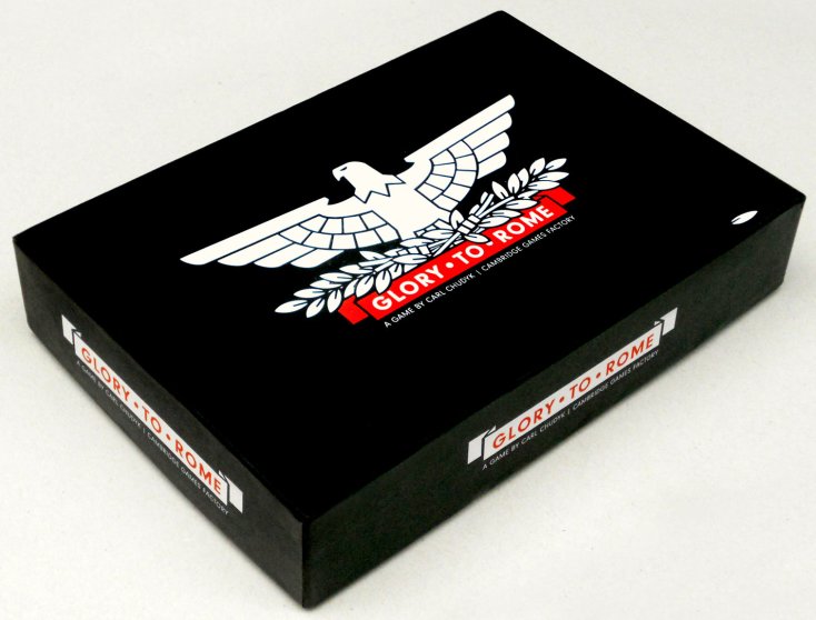
11. Glory To Rome (2005 — Cambridge Games Factory)

When low on budget, shoehorn the set-up image from the back of the box next to the art on the front.
This looks like it was commissioned by the local education board to make Roman History ‘fun and whacky’ on the lowest possible budget, and with the dullest possible font.
This is apparently the “I.V.” edition. I need one after looking at this, preferably drip-feeding me mescaline to make it all better.
(N.B. There is a Black Box edition of this game that is really rather tasteful and shows how it should be done.)
10. Inhabit The Earth (2015 — R&D Games)

Apparently the aim of this game is to inhabit the Earth with drug-crazed fauna. I don’t know what they’re on, but I want some of it. Especially whatever the panda has scored.
To her credit, the artist has managed to give the lion an eerie, thousand yard stare that’s tricky to pull off. He’s seen some sh*t has that lion. “You weren’t there, man. You weren’t there! You don’t know, man!”
(N.B. Although this cover is a tongue-in-cheek tribute to the Ravensburger classic Wildlife Adventure, that still doesn’t explain all the junkie animals.)
9. Roll To The South Pole (2012 — Rio Grande Games)

As Monty Burns regularly said: “Release the hounds!”
Rio Grande have produced some half decent box art, so I don’t know what the hell happened here. It’s awful on so many levels from the rabid man-eaters pulling the sled, to the crazed, beardless Santa on the back.
I’ve no idea why the sled in the foreground is pulled by both giant and midget dogs, any more than I know why it only needs four of them to the other sled’s eight (some of whom appear to have human faces).
However, all that pales into insignificance when you consider the central dog’s FIVE LEGS! (Well spotted Sven!)
8. Incan Gold (2005 — Fred Distribution)

Robert Redford should sue over being depicted like this, wearing grandad pants up under his armpits , ear-arm grasping at random branches and staring vacantly not at the huge temple in the background, but (perhaps predictably) at the godawful logo, designed by someone with too much access to both Photoshop and hallucinogens.
The less said about the statue fapping its glowing golden penis the better.
7. Europa 1945–2030 (Eurogames)

Of all the things to fixate on when designing the box art of this game about birth of the European Union, the designers chose the word “birth” (naissance). And not one person during the entire production process stopped them. Shame on you!
Veteran reviewer Tom Vassel actually rates this game pretty highly, so it must have redeeming features beyond its funky jigsaw-like map components. However, a glowing baby on the front looking like it’s crapping stars isn’t one of them.
6. Hamburgum (2007 — Eggertspiele)

Sh*tburgum, more like. Even his gloves are praying for the artistic butchery to end. The flock of birds is about the most realistic thing in this whole picture, which isn’t saying much.
The church looks like the artist kept getting feedback about making the tower “just a little bit taller. Yeah, just a bit more”. So he kept adding formless greenish blue blobs to the top, (ever so slightly off-centre each time), until he just lost it completely and stuck a big-off unrealistic red flag on top and called it a day.
5. Freya’s Folly (2005 — Sagacity Games)

Just slightly edging clear of Hamburgum is this travesty. Apparently the artist was hired solely for his work done on the spear point, after which things went rapidly downhill. Those empty, lidless eyes staring out of that mysteriously unshaded face would give anyone the creeps.
Quite why the artist spent so long rendering that ornate necklace is as much a mystery to me as why it’s floating an inch from her chest. The time would have been far better spent making a half-decent job on the yellow Oompa-Loompas in the background.
4. Seven Sisters (2012 — Wishing Tree Games)

Artist: “So how do you want these sisters to look on the box cover?”
Client: “Tastelessly slutty and drawn with no anatomical sympathy whatsoever.”
Artist: “That’s a relief. I can’t draw legs for sh*t. They start off fine and then I go and stick a kneecap on the side of their thigh for no reason.”
Client: “In that case best make the rest of the dresses less slutty and more billowing-ball-gown. Or an absurd mix of the two. Or just hide their legs behind a floating chaise longue or something. Or both.”
Artist: “Won’t their legs be visible if it’s floating?”
Client: “Just make them amputees. No one will notice. Oh and add a nice architectural surround.”
Artist: “Sure. In what style?”
Client: “How about a subtle mix of Classical Greek and Indian Restaurant… on a chess board?”
Artist: “Whatever you say. I’ll chuck in a sh*t custom font for free.”
3. Choose Your Crew: Rockband (2014 — The Game Crafter)

Yeah! Play It Loud! Draw It Crap!
I’m pretty sure the lead singer was the inspiration for the Dancer of the Boreal Valley from Dark Souls. She’s certainly… flexible. And not in a good way. More in a crawl-backwards-down-the-stairs-like-a-spider kind of way.
That’s before we even get to the lead guitarist with his bizarre deformed arm. I pity the poor tattoo artist that had to ink that freakish appendage. Probably the best (comparatively) figure of the lot is the bassist, who looks genuinely embarrassed being there.
2. Roads And Boats (1999 – Splotter Spellen)

I think the only reason this art got past quality control is that the rest of the Splotter publishing team were working hard on making the most ludicrous title logo possible.
“But both ‘Roads’ and ‘Boats’ have ‘oa’ in them! There must be some way we can use that!”
Just let it go okay? Let. It. Go.
The only possible explanation for this travesty is that it was done by a child of one of the publishers and they hadn’t got the heart to say no. Still, if you think this is crap, you should see what the kid produced for its expansion, &Cetera.
1. Cannes (2002 — Splotter Spellen)

Ah, Splotter, up to your old tricks again eh? This winner of the crown of Crap Box Art is so bad, I almost love them for it.
The little green dice-playing otter is actually a pretty cool logo. I have no idea why he’s about to be devoured by sharks, any more than I know why Kylie and Jason are making an appearance, or… I mean what the hell is that at the bottom?
If you think the components are any better, guess again. Honestly, don’t look inside the box. All the crimes against art in the world are contained within. Don’t say I didn’t warn you.

